Tekion Store
Tekion Store is a SAAS ERP tool to maintain, replenish, & deliver automotive parts to dealerships. In 2021, I collaborated with product managers and engineers at Tekion to solve the end-to-end ERP inventory management workflow. I led the design of this B2B store module that automated core inventory operations, significantly reducing manual effort and improving setup completion time by 80%.
Problem
Manual Workflow Process
Solution
Scalable-tech Integration (ERP Module)
Business KPI
Setup Completion Time
Timeframe
2 Months
Role
Lead Product Designer
Organization
Tekion
Year
2022
Understanding Challenges
In organizational structuring, workflows that feel “efficient” during early stages often affect the business later. Why?
Let me explain with an example
In the early days of an organization, when we’re handling only a few clients, it’s common human psychology to set up quick and familiar workflows in each department to get the job done fast and get the business started. But what feels “efficient” during those early moments often comes back to affect the business growth.
Because we forget to ask: are the workflows scalable?
At Tekion, automotive dealerships were relying on manual inventory management workflows to manage and update their automotive store inventory.
How did this affect Business?
With more clients coming in with an influx of orders, the traditional workflows became slow, causing frequent order delays, billing issues and a poor CX affecting business!
This project was a successful attempt at scaling one of the already established manual workflows at Tekion - The Inventory Management System.

Reframing the problem (HMW)
How might we enable automotive inventory managers to place bulk parts orders with fewer staff and in less time?
Understanding the existing workflow (JTBD)
Issuing parts, estimating prices, and negotiations were manually handled by inventory managers on paper slips. As orders increased, limited inventory visibility, limited staff availability, and the manual workflow led to frequent booking errors, miscommunication, and delayed order completion.

Fig. I created this flowchart of the existing workflow to understand the current process and identify inefficiencies.
Few of the articles I researched to understand best practices and solutions in Inventory Management systems.
Issues with the existing flow
The existing operation relied heavily on (a)manual workflows, with inventory managers issuing parts, estimating prices, and negotiating on (b)paper slips.
This approach lacked adequate inventory visibility and required substantial staff time, making it especially inefficient during bulk orders. As volume grew, delays in order placement and frequent billing issues began impacting both operations and customer experience.
(a) Manual Workflow Process
Most dealership operations were handled manually, with little to no digital automation. Tasks like issuing parts, verifying stock, and updating order status required multiple human touchpoints. This made the process slow, inconsistent, and error-prone
(b) Paper Slips
Managers had to manually record part numbers, quantities, and prices, then reconcile them at the end of each day. This lack of digital traceability caused frequent mismatches in records and limited real-time visibility into parts availability and sales performance.
We got on a call with the Inventory Management team to understand more about the steps they take to complete an order.
Challenges they face throughout the day.
and, on the side, I began my need finding research by exploring articles online to understand inventory management better i.e, its terminologies, the process structure, key roles, and how leading industry brands tackle inefficiencies in their systems.
Toyota OEM’s (JIT + Kanban) kanban approach
Toyota’s JIT/kanban approach reduces on-hand stock but increases dependency on supplier resilience.
researchgate/Toyota Motor Corporation: Just in Time (JIT) Management
Auto parts retailers (AutoZone, NAPA, O’Reilly)
These chains use ML demand-forecasting to optimize stocking levels and reduce stockouts.
cleverence/How AutoZone and NAPA Auto Parts Use Machine Learning to Forecast Demand
Walmart (RFID)
RFID rollouts dramatically reduce counting time and improve store-level inventory accuracy.
impactlabel/What Walmart’s RFID Rollout Means for Your Supply Chain
Turning failure & chaos into opportunity
Research showed 3 effective levers for inventory efficiency:
(a) automated item-level tracking.
(b) ML forecasting for demand & replenishment.
(c) lean JIT/kanban, where supplier networks allow it.
So the first step in our case was to implement the Level 1 ERP Inventory Management module, enhance it with improved features over time, and optimize the overall portal experience.
What would be an Impactful solution
to the problem?
I could deliver 10 solutions in 10 ways, but impact only matters when it moves a meaningful KPI metric.
Early in the project, while defining requirements & scope with the product team, I was keen on understanding how we would measure success.
While interviewing the target audience & trying to understand their concerns, a recurring feedback was “It takes too much time to complete an order with the current workflow” and “during bulk orders, we are swamped with multiple order placement tasks and some orders get delayed…”
So we identified “Setup Completion Time” as a key metric. If our solution enables users to complete tasks faster than the current workflow, it not only improves workflow efficiency & the employee satisfaction index but also makes the implementation of the solution far more likely to be adopted.
Refinement through rapid prototyping
The success of my work largely relied on rapid prototyping and iterative testing sessions with the target audience, i.e. the Implementation and Inventory Management teams, through weekly meetings and syncs.
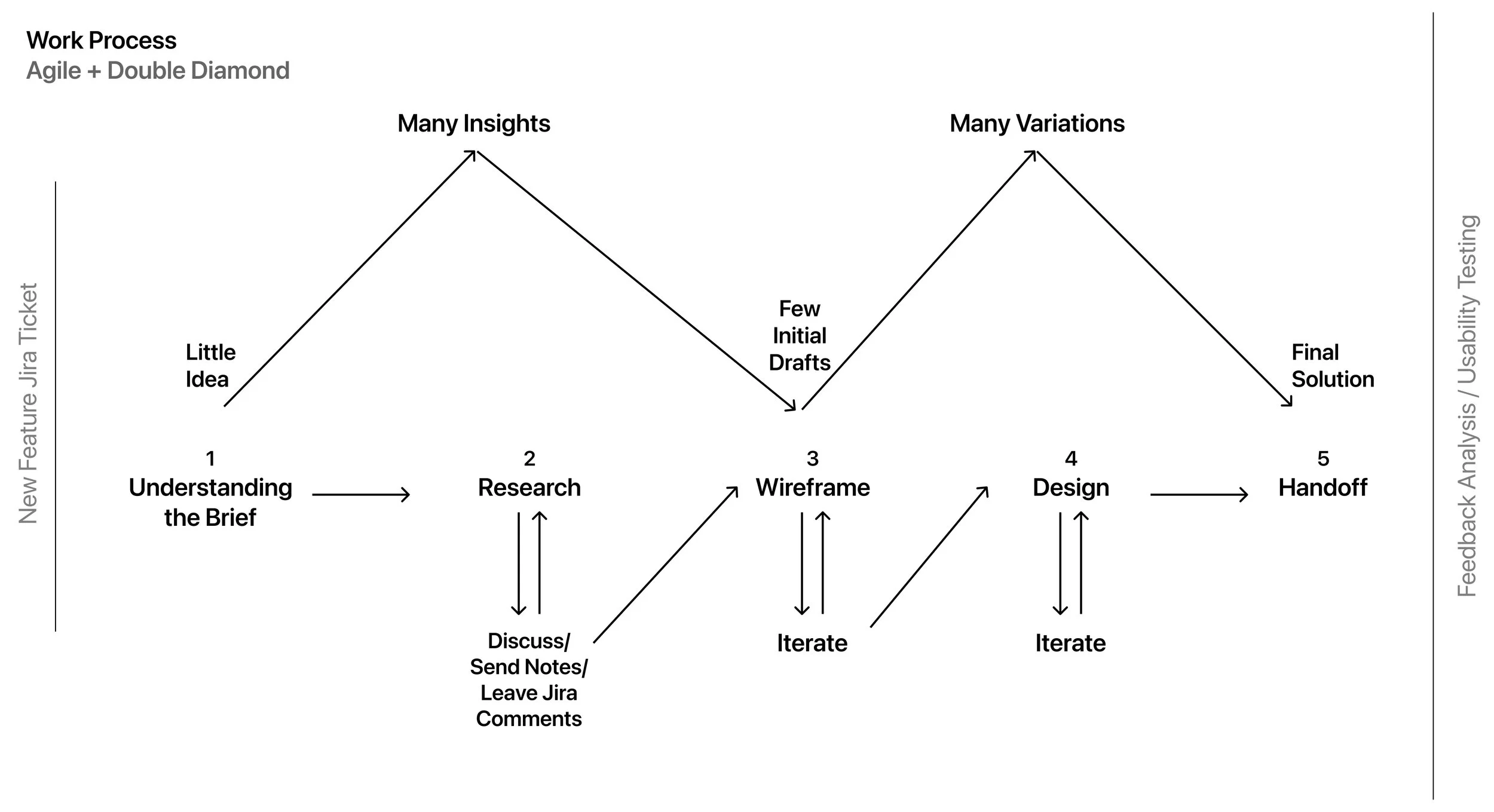
On a personal level, I followed the Double Diamond design process to ensure quality outcomes, documenting insights at every stage and later using them to brainstorm solutions collaboratively with my team.
User Persona Mapping
Assessing the target user’s technical capability and feasibility, from interviews with 3 Inventory Managers and 1 Implementation Manager. It captured their work environment, daily responsibilities, key frustrations, and core motivations.
Job Title
Inventory Manager/Implementation Manager
Industry
Manufacturing & Distribution
Location
Global
Technical Skills
ERP systems (SAP, Oracle Netsuite)
Primary Role
Manages inventory across multiple locations
Goals
• Maintain optimal stock levels to meet demand without overstocking
• Reduce manual data entry and paperwork
• Establish a tracking system between dealerships and Central Inventory
Frustrations / Pain Points
• Dependence on Slips creates inefficiencies
• Becomes very hectic during multiple bulk orders
• Limited Inventory Managers
Major takeaways from qualitative research sessions
· Users need to automate bulk order processing and stock updates.
· A highly functional desktop dashboard for quick inventory checks.
· Reduce dependency on slips/paperwork.
· Real-time alerts and notifications for stockouts and approvals.
· Simplify onboarding for new managers with guided workflows.
Research Insight 1: User Psychology, Eye Movement.
Inventory Managers handle multiple orders during their shift and might need to “quickly juggle” between the available products and the cart to confirm the right item in the right quantity.
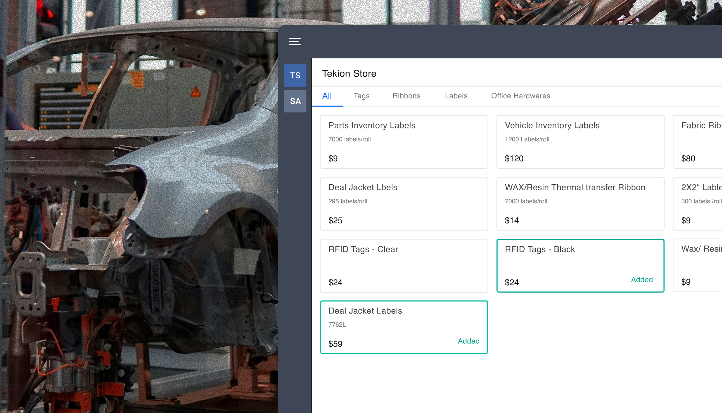
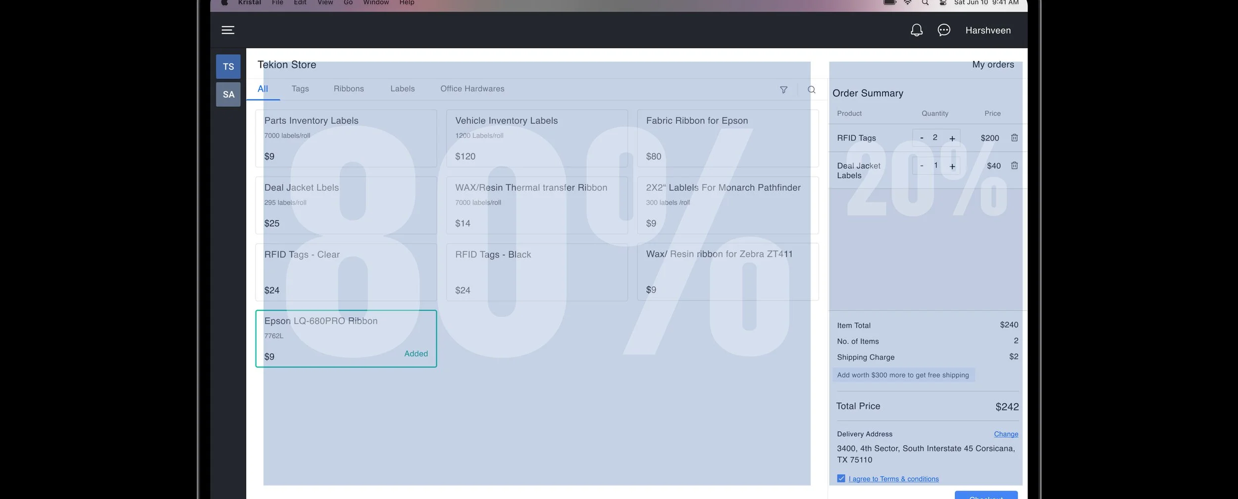
So I structured the portal layout with an 80/20 split i.e 80% dedicated to product listings and 20% to the cart, to prioritize product exploration while keeping the cart accessible at all times. Some of the industry brands that follow the same approach are Nike, Amazon, Forever 21 an& Bose.

Research Insight 2: Information Architecture
The inventory managers are familiar with the different products as part of their job. On a busy day, they don’t have time to read through descriptions, they just scan real quick.
Since the page layout is already busy with too much data, it's best to keep individual components as simple as possible, including only the information “relevant for decision-making”. The design that struck the right balance between “too much” and “too little” was chosen.


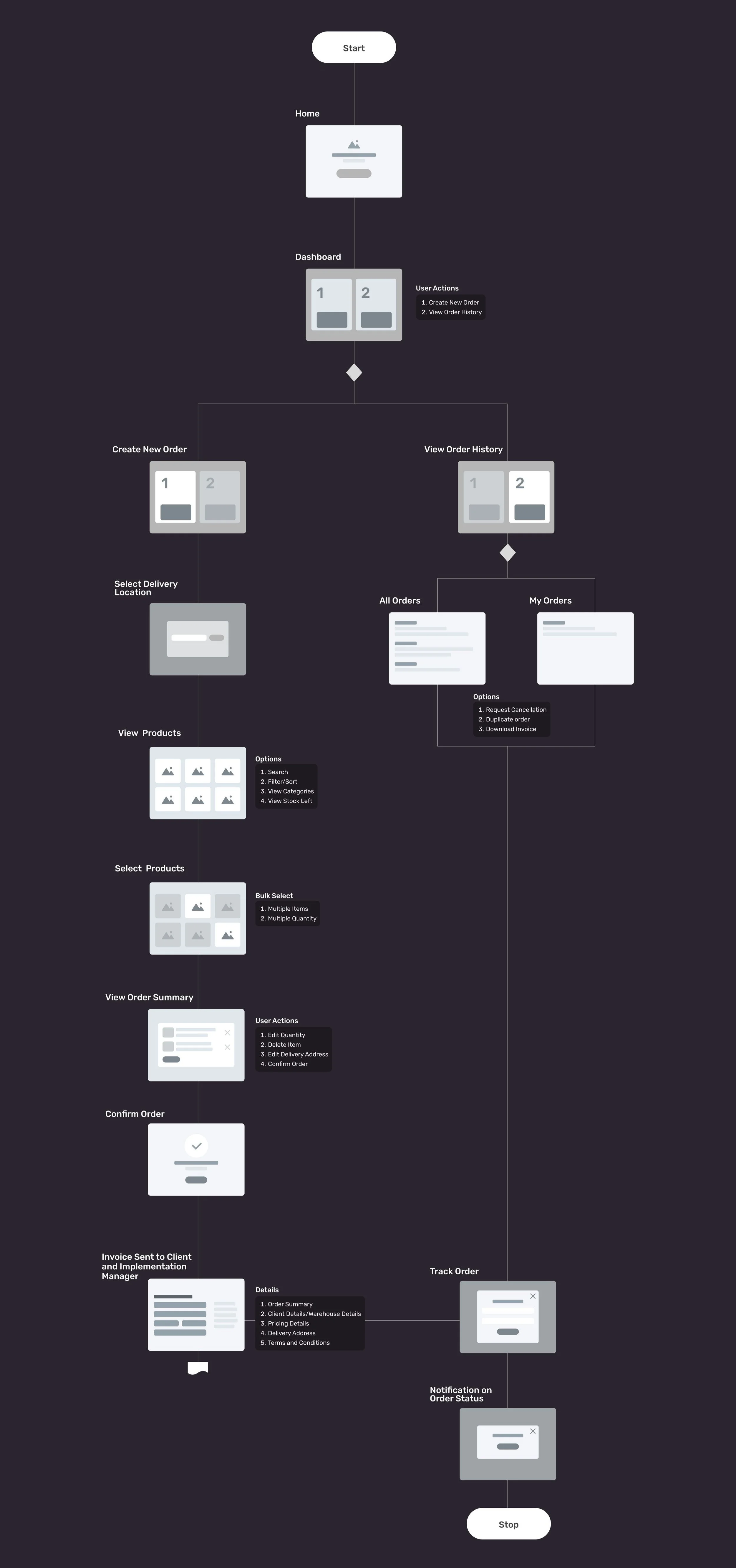
After analyzing the parts-order workflow, I created a website mind map outlining screens, edge cases, and interactions, identifying which parts of the portal required separate pages and which actions could be handled through UI components like modals, sheets, drawers, and popovers to streamline the experience.
Designing for Developer Constraints
-
I designed each component block, spacing elements, layout structure, margins, and padding on the 8px grid for simplifying responsive design, ensures consistent spacing across components, and aligning seamlessly with common screen resolutions and pixel densities.
-
The tool ensures consistency in terms of components used, for which everything used in the interface design was picked for the existing design system leading to a uniform user experience throughout the product, & also minimizes additional UI dev effort.
-
It aids responsive design by allowing scaling across multiple screen sizes, enabling adaptable layouts that maintain usability & aesthetics across various breakpoints.

Solution
Replacing manual workflows with a scalable, tech-driven ERP module.
(a) My solution streamlined the inventory workflow by eliminating paper slips, reducing manual data entry, and minimizing errors.
(b) The solution enables inventory managers to place orders quickly with minimal learning effort.
(c) It provides real-time visibility across locations, supports mobile access for on-the-go updates, and integrates seamlessly into existing ERP systems.
Efficiency = Faster task completion
Scalability = Easier to expand and maintain
Accuracy = Less errors through clearer workflows


Usability Testing
2 months after implementation, we achieved a high user satisfaction index and an 80% reduction in setup completion time.
Earlier, placing an order from start to end would take ≈10 minutes, and now it took ≈2 minutes. We saw an ≈80% improvement in the order placement workflow.
Test Setup to measure the impact
· Ran guerrilla testing setup with the same research users.
· Asked them to complete the full flow independently. Once with the existing manual workflow and then the other with our solution.
· Observed where they stopped and what made them stop.
· Did a similar exercise with multiple random participants
· Observed and compared the timings.
· Asked them to fill out a quick survey for the satisfaction index.
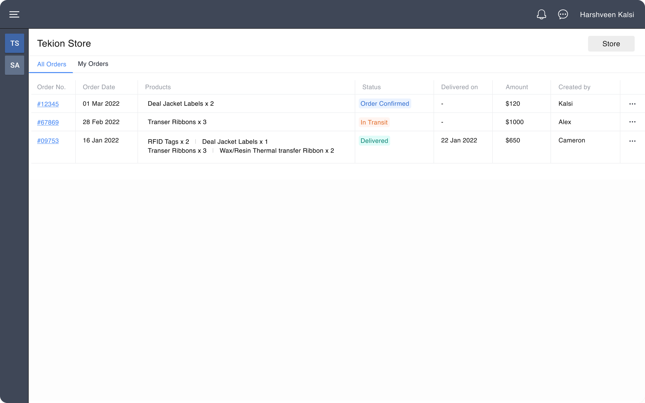
Use Case
Placing an Order
Primary Actor
Inventory Manager
Preconditions
Primary actor detects a shortage of Inventory items
Goal
To place a bulk order as quickly as possible with the right items and the correct delivery address
Triggers
The primary actor should know the exact details of the parts to be ordered.
By transitioning from a manual, paper-based inventory system to a streamlined ERP module, we achieved an 80% reduction in setup completion time. This project not only enhanced operational efficiency but also highlighted the importance of scalable design solutions in driving business outcomes while maintaining a high employee satisfaction index.
Thank you for reading this case study, showcasing my process, the energy I invest, and the brain cells I burn when I am focused on solving complex challenges.
Let’s connect to discuss further, or explore my other projects.