Rethinking
Financial Advisory
Building a product for the 68.7% who struggle with financial decisions.
A data-driven research study on financial customer behavior and the psychology behind financial advisory. I spearheaded key activities such as user interviews, surveys, feedback analysis, and market research. Leveraging these insights, I designed a solution that addressed a critical problem faced by 68.7% of our target audience.

Work Done
User Research + Mobile Application
Timeframe
4 Months
My Role
UX Research + Design
Year
2021
Background
In 2021, we explored how COVID-19 reshaped the financial services landscape by conducting interviews with financial advisors and everyday users. We discovered that only a small number of people actively consult financial advisors. Most individuals are either unaware of the benefits of professional financial guidance or rely heavily on family and friends for advice.
Seeing this gap as an opportunity, in a team of 4, I conducted extensive market research, developed user personas and empathy maps, understood user behaviour patterns, and identified the challenges faced by both financial advisors and common users. Based on these insights, I designed an app as the solution to provide a more direct and effective medium for users to connect with financial advisors.
Research Hypothesis
If users are provided with an accessible platform that builds trust and awareness around professional financial advice, more individuals will choose to consult certified advisors instead of relying on friends and family.
User Interviews
I developed two user personas: Financial Advisors and Common People, to understand their respective perspectives and emotions toward financial advisory.
Working in a team of 4, we made a list of financial advisors and common individuals, connected with them over LinkedIn and email, explained to them the cause of the research study and sent formal invites for interviews. While participation was limited, survey results provided sufficient data to determine user patterns. Finally, we created empathy maps to identify shared behavioral trends for each group.
User Journey Mapping
I created this journey map on Miro to highlight how users felt at various stages of their financial journey.This map provides insights into where to begin addressing key issues and where to conclude improvements. User frustrations start right in the exploration stage and continue to increase as they struggle to find the desired result, so our primary focus is to start improving the journey at the exploration stage for better later-stage outputs.
User Behavior Mapping
After conducting user interviews, engaging with financial advisors, analyzing research findings and creating the Journey map, I mapped behavioral patterns to highlight user needs and the underlying motivations.
Users face challenges such as understanding complex financial concepts, managing personal finances, and staying updated with market trends.
They require a medium that connects them with trusted advisors for personalized guidance, addressing seasonal financial needs like tax filing, investing, and portfolio management.
Competitor Analysis
For competitive analysis, I identified competitors that aimed to solve the same problem. Analyzed the steps taken to complete the primary tasks on their platform, understood the navigation structures, and went through customer feedback to identify points and areas of improvement.
The target brands were Fiverr, FundsIndia, & Scripbox. I performed a SWOT analysis to understand their application’s key weaknesses and later included those weaknesses in our solution’s strengths.
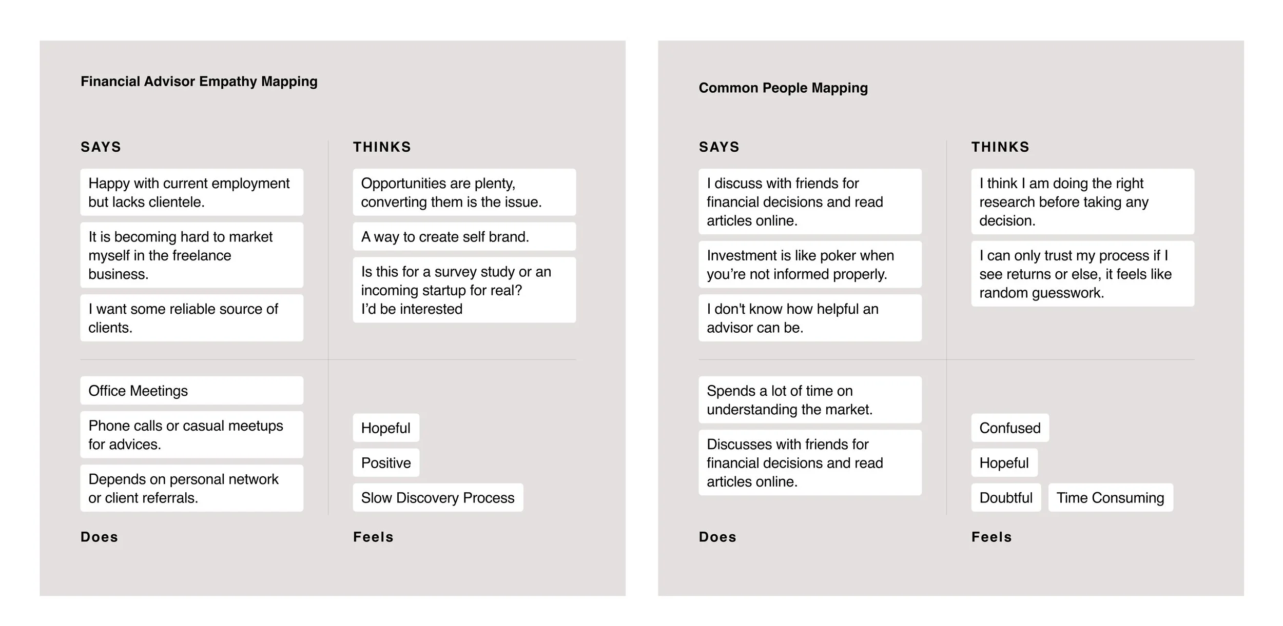
User Interview Empathy Mappings

User journey Mapping

User Behavior Mapping

Competitor Analysis
Research Insights
(a) From User Interviews:
Common people are often unaware of the benefits of consulting a financial advisor and tend to rely primarily on family and friends for financial advice.
(b) From User Interviews:
Finding clients as a freelancer can be exhausting, especially when building trust in the very first interaction is the biggest challenge.
(c) From Surveys:
Out of 98.7% people who seek financial advice, only 30% consult financial experts, while 68.7% rely on friends and Family.
(d) From Competitor Analysis:
While the market already has platforms connecting users to financial advice, they consistently fall short in easing initial engagement and building trust.

Based on our 2021 research aimed at understanding financial customer behaviorImpactful change through purposeful tech innovation
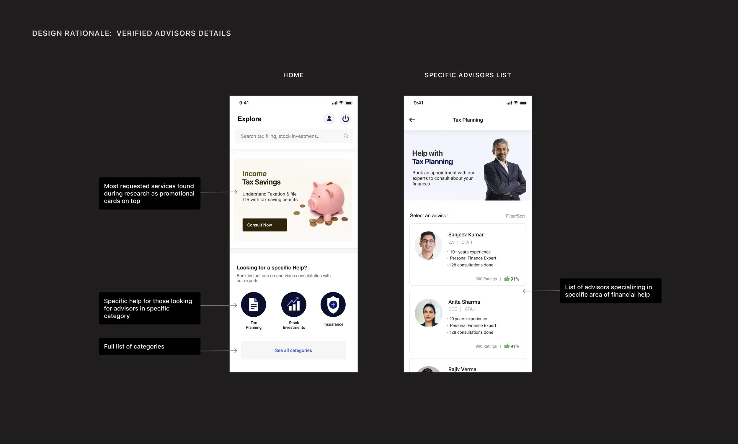
Since most users are already comfortable with mobile applications, we identified it as the ideal platform to bridge the gap between financial advisors and retail users. The application would enable seamless connection and collaboration between both personas.
Retail users can easily sign up, explore verified financial advisors on the application based on their needs, and access trusted guidance from anywhere, whereas Financial advisors can list their services, build credibility, expand their client base, and grow their independent practice.
By bringing both sides together on a single platform, we aim to democratize financial advisory making it more accessible, transparent, and personalized for everyone.
In a nutshell, the mobile application is a “trusted, beginner-friendly gateway” platform that connects retail users to certified financial professionals, starting with education + discovery → then advisory match → then ongoing support.
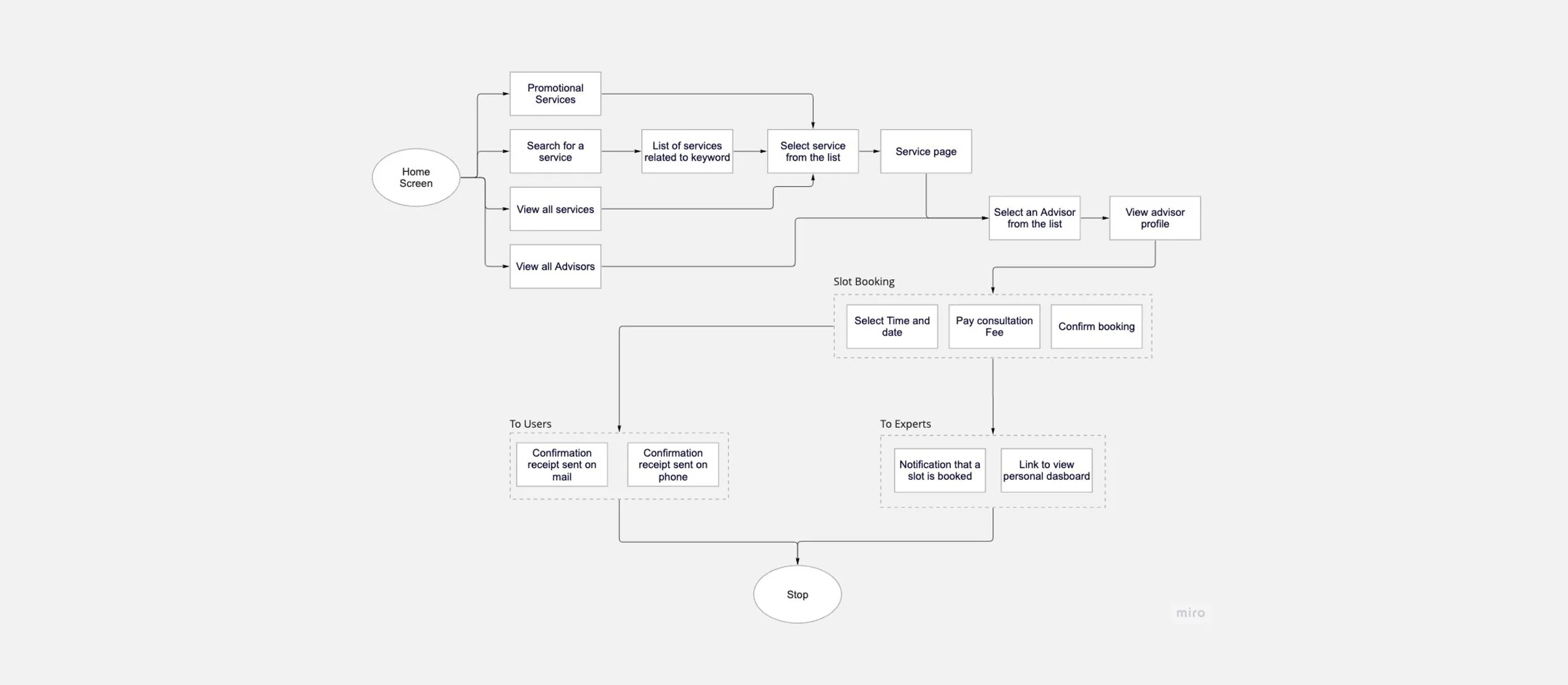
Primary Task Flowchart
The flowchart outlines how navigation works on the application.
Starting from the home screen, users can explore promotional services, search for specific services, view all services, or directly access advisor profiles.
The journey progresses through service selection, slot booking, and payment of consultation fees, culminating in confirmation receipts sent to users via email or phone.
Simultaneously, advisors receive notifications and access their dashboards to manage bookings. This structured flow prioritizes simplicity and efficiency, addressing the communication gap between users and advisors while ensuring a user-centric experience.
Minimum Working Flows
To define the minimum viable product (MVP) features, I worked with developers to utilize the Impact Effort Matrix and the MoSCoW Approach. We did this to balance resources in hand and the project delivery timeline.
The Impact Effort Matrix helped prioritize features by focusing on "Quick Wins" like account creation, booking slots, and generating offline meeting links, which deliver high impact with low effort.
Simultaneously, the MoSCoW framework categorized features into Must-Have, Should-Have, Could-Have, and Won’t-Have. For example, essential elements like information visibility, accessibility, and a responsive user interface were marked as Must-Haves, ensuring they form the backbone of the MVP.
Wireframes
Before jumping into wireframing the concept, I had a couple of meetings with the developers to understand the constraints and capabilities of the team, so that we all work in the same page to ensure features and functionalities I design would be incorporated in time and with ease.Post discussion, I spent a few days designing the information architecture and how a user would navigate from one flow to another.The following are the app wireframes I finalised. Some of them are designed quickly on a UI kit (top), and a few of them, which require some key details, are done from scratch (bottom)
Primary Task Flowchart

Minimum Working Flows
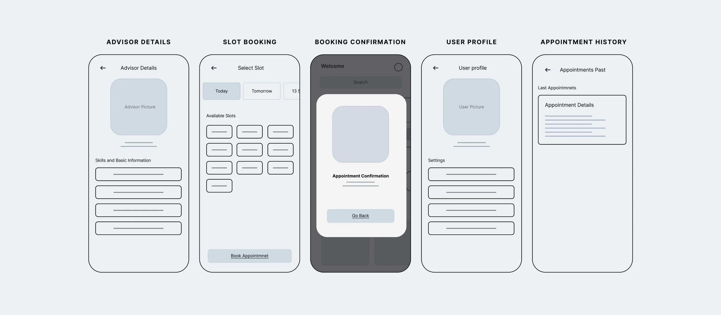
Wireframe Set 1
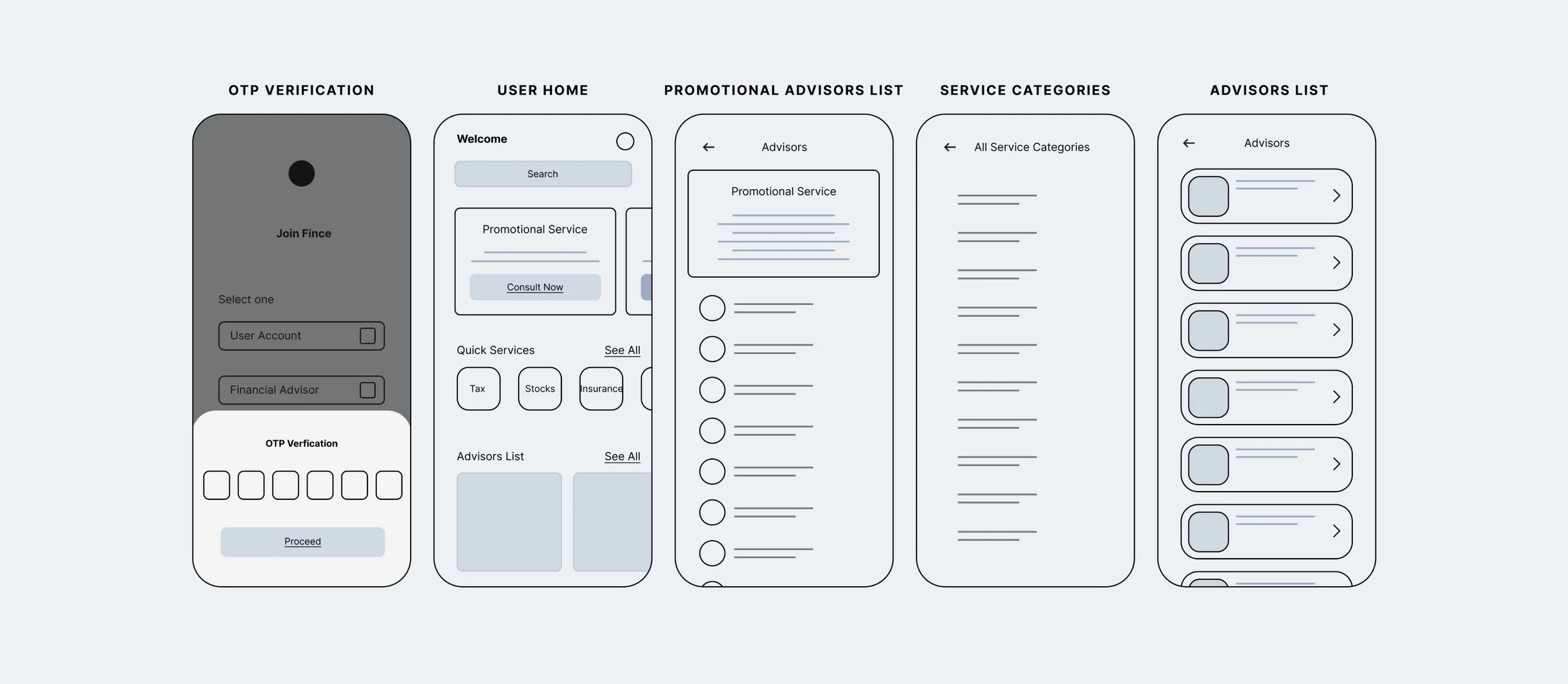
Wireframe Set 2
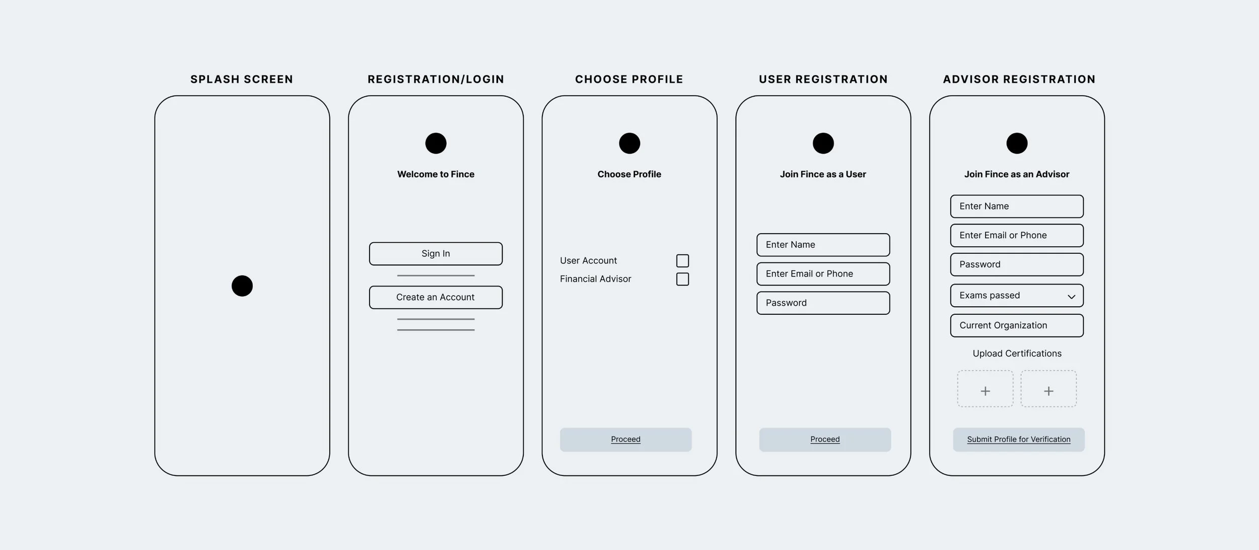
Wireframe Set 3


Working prototype
According to my experience in the industry so far, an app that caters to users’ needs in each phase and helps them make decisions quickly has higher user retention.
Following Hick’s law and progressive disclosure, the app’s information architecture in the wireframing stage was kept standard and simple to reduce the learning curve.Here’s a prototype to quickly see how the app worked.
Usability Test
The goal was to evaluate how effectively our app addressed the core problem and how intuitively users could complete key tasks. To do this, we designed a structured usability testing plan.
We reached out to participants who had expressed interest during the research phase and provided them with a usability guide that I created, ensuring consistency in the testing approach. Throughout the sessions, we observed user interactions, captured completion times, and noted moments of friction or confusion.
By analyzing the collected data, we identified what worked well, where users struggled, and which areas required improvement, helping us refine the experience to better meet user needs.


Reflections
This project spanned several months and consumed a significant portion of my time.
What began as a simple research exploration soon evolved into a fully realized application as we uncovered its real-world potential. Despite my prior experience with a Fintech product at Kristal.AI, navigating tasks like participant recruitment, conducting interviews, and translating insights into actionable outcomes was both challenging and rewarding. This project not only strengthened my user research and product validation skills but also reinforced the importance of persistence, collaboration, and user-centered decision-making in bringing an idea from concept to reality.