Importance of accessibility and inclusivity in driving business impact.
Abstract
Each user is unique. Digital products should be accessible and inclusive, not only because it is the right thing to do but also because it makes good business sense. An estimated 15-20% of the world’s population lives with a disability of some kind, and an estimated 15-20% of the world is neurodiverse. We cannot afford to exclude these users from our target markets. ~ Tanner Kohler, NG Accessibility and Inclusivity, 2023
This research study highlights the importance of accessibility, specifically in digital products, to support users with varying abilities. Many users struggle to interact with digital products because of visual, auditory, cognitive, emotional, or motor challenges. Through this research study, I aim to emphasize the importance of accessibility and inclusivity in driving business impact.
1. Use Case
Zara Web was selected as the use case due to its global reach and the critical negligence of accessibility in its platform experience. The website was evaluated against the Web Content Accessibility Guidelines (WCAG) 2.2 standards, with a focus on the core principles of perceivability, operability, understandability, and robustness. The objectives include:
1. The COVID-19 Effect
When the coronavirus affected the offline shopping experience worldwide, people couldn’t resist the urge to shop online, and that’s when reality hit hard for ZARA. With approximately 1200 offline outlets being shut down, the fashion clothing brand faced a 44% sales slump in its business, making it a major cause of concern.- managementtoday, 2021
For the readers who’re not aware of ZARA, it’s a fast fashion retail subsidiary of the Spanish multinational fashion design, manufacturing, and retailing group Inditex - Wikipedia
Understanding the Brand
While the successful clothing brand excels at incorporating customer feedback into its clothing collections—“pulling” ideas from consumer demand rather than pushing pre-designed lines, it neglects feedback in the digital space. Users consistently voice frustration with the online shopping experience, yet their concerns remain unaddressed. Ironically, this negative feedback comes directly from the brand’s core audience, the target user persona, the very customers who shop, wear, and champion its products.
Core audience age group,
Primary: 18-40
Strong Focus: 21-30
If users from the strong focus group are facing accessibility challenges in the online shopping experience, then we know from research that, as humans age, these challenges only get amplified. Cognitive usability performance decreases by approximately 0.8% per year between ages 25 and 60. Imagine the frustrations of older adults on the platform, chances being most of them leaving the platform, contributing to the drop-off rate.
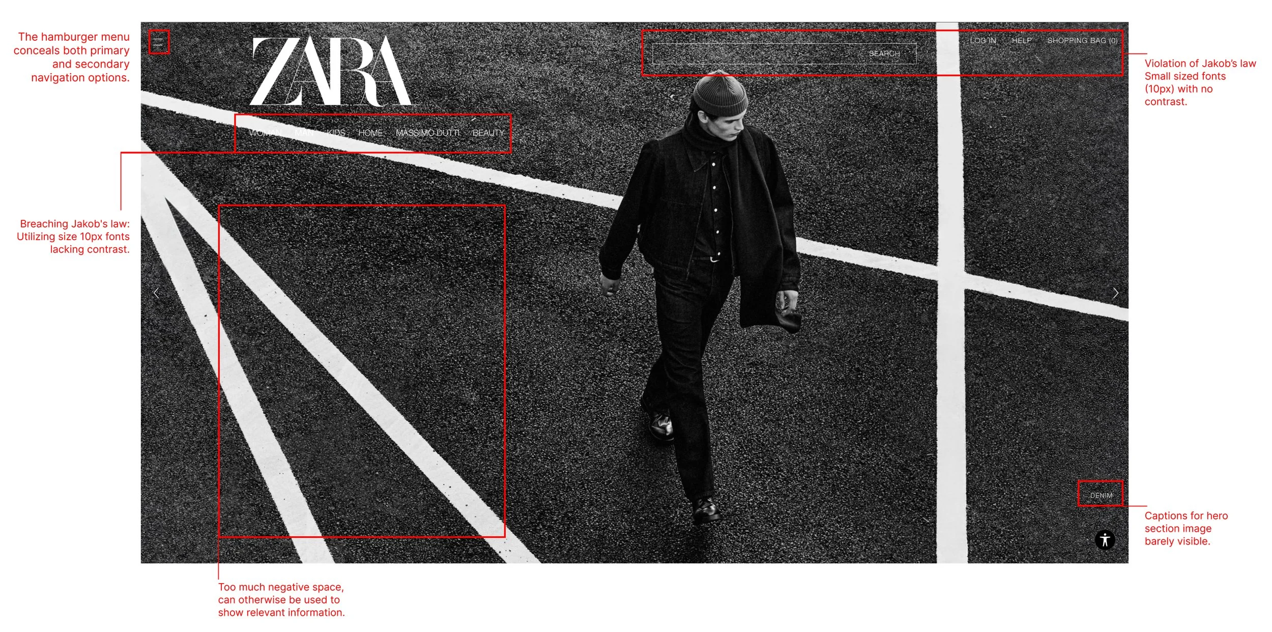
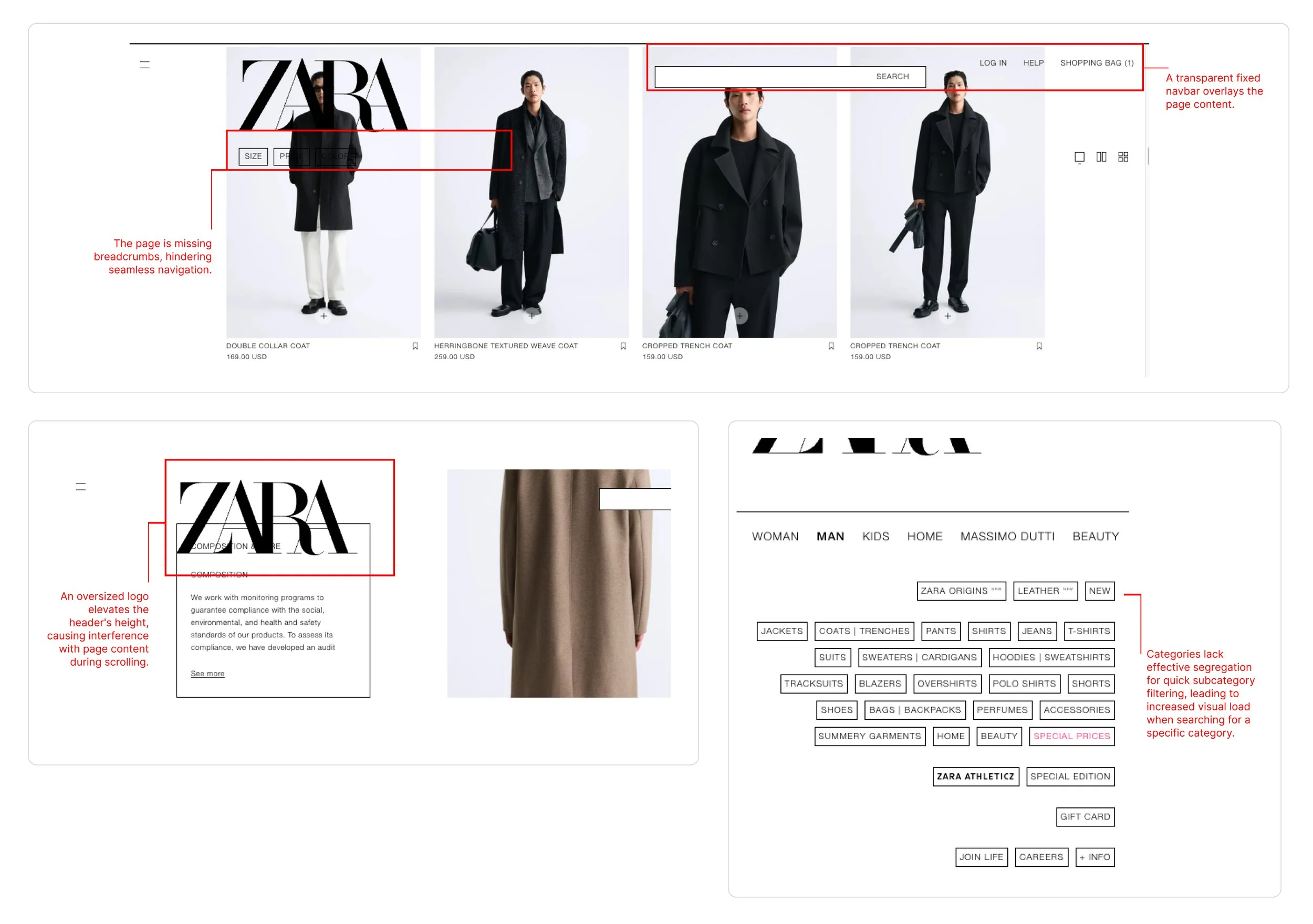
Busy Images combined with low-contrast navigation patterns increase the exploration journey for first-time users. Especially when you want the customer to explore your product offerings, they shouldn’t be searching for certain key areas like search bar, navigation links, and categories.


Unintuitive complex navigation making it difficult for users to find specific categories or products in first 5 seconds. According to Sciencedirect.com, navigational links should be visible within 5 seconds”

Over-reliance on overlaying imagery sometimes at the expense of clear text readability & legibility, making it harder for users to scan what’s written, squint eyes, or ignore the context.

2. Heuristic Evaluation
I tested the website against the Web Content Accessibility Guidelines (WCAG) 2.2 standards, and Jakob Nielsen's 10 Heuristics, focusing on key principles of perceivability, operability, understandability, and robustness.
I assembled a small, diverse group of research participants to gather a broad range of insights and identify recurring feedback patterns. The basic instrcution and prepartion for the evaluation was based on How to Conduct a Heuristic Evaluation by NNG Group
3. User Interviews
Objective
To understand user behaviors and pain points when using Zara’s website.
Participants
5 participants (2 female, 3 male) aged 22–25, representing Zara’s target demographic.
Sample Questions
How often do you order from ZARA?
Can you describe your experience with ordering?
Did you spend more time than expected ordering online?
Are there any significant roadblocks in your way?
What are your views on the mobile app?
Sample Tasks
Add a product from the “x” category to your cart and finalize the payment.
Navigate to the “y” part of the platform
Raise a platform concern
Can you browse the “z” category products
Ethical Considerations
Informed Consent
All participants provided informed consent before participating in interviews and surveys.Anonymity
Participant data was anonymized to protect privacy.Data Security: Survey and interview data were stored securely and used only for research purposes.

Here’s a sample empathy map that I created to capture what the user said, felt, did, and thought during the interviews. This map helped us pinpoint the sources of user frustration.

Feedback Analysis
We dived deep into customer reviews to identify user emotion patterns towards the online presence to find that Zara had a 2.08 star rating from 1,132 reviews, indicating that most customers are generally dissatisfied with their online platform experience.
”…Zara ranked 43th among Best Global Brands in the year 2023. It was ranked 25th in 2018 and has kept dropping ever since…”


Code Inspection
On inspecting the web portal code to identify the design intricacies, we found that certain spacings, layouts, typography sizes, and most importantly,y the choice of background image used was interfering with some industry standard accessibility guidelines.
Research Findings
The evaluation revealed significant usability issues, particularly in navigation and checkout processes.
Users struggled with ambiguous labels, inconsistent design, and a lack of feedback, leading to frustration and task abandonment.
These findings align with previous research on e-commerce usability, emphasizing the importance of clear navigation and error prevention., Layouts, typography sizes, and most importantly, the choice of background image used, were interfering with some industry standard accessibility guidelines.
Possible Improvements
Improved Navigation: Updated layout features ample white space and evenly distributed information essential for guiding users through their intended actions.


Onboarding starts with Information Clarity.
As part of my UX revamp, the website now features an improved onboarding process. After each development release, new features that benefit the user will be presented to returning customers through modals. We chose modals because they direct the user’s attention to key information, allowing them to focus on the content while keeping the background out of focus.


Feature Improvement: Sticky Pane for Major User Actions
To enhance usability and streamline the user experience, we propose the implementation of a sticky pane on the right side of the website. This pane will occupy 20% of the screen real estate and provide quick access to the most commonly performed tasks, ensuring that key functionalities are always within reach. The sticky pane will remain visible as users scroll, offering consistent and intuitive navigation.
Improved Accessibility
Key actions are always visible, reducing the cognitive load on users.
Enhanced Efficiency
Users can perform common tasks without navigating through multiple pages.
Consistent Navigation
The sticky pane ensures that essential functionalities are always accessible, regardless of where the user is on the website.
User-Centric Design
By prioritizing the most frequently used tasks, the design aligns with user needs and behaviors.
The same usability task results showed a user confidence boost of 60% on average.
I carried out moderated usability testing, focusing on task-based evaluation and comparison to the original version, to validate the prototype's usability and functionality.
Participants were tasked with comparing the navigation and overall layout of Zara's website to our prototype. Subsequently, they were assigned specific tasks, such as locating an item and placing an order, allowing us to assess the user experience comprehensively.
Learnings
Enhancing an interface doesn't always necessitate an extensive budget or a complete overhaul. Sometimes, minor adjustments can wield a substantial impact.
This paper served as a reminder that even prominent brands with successful products and services can undergo significant improvement without incurring exorbitant costs.
Conclusion
This study employed a mixed-methods approach to evaluate the usability of Zara’s website, combining heuristic evaluation, user interviews, and surveys. The findings revealed significant usability issues, particularly in navigation, checkout, and product discovery. By addressing these issues, Zara can enhance the user experience, increase customer satisfaction, and improve conversion rates. Future research could include usability testing with prototypes to validate the proposed recommendations.
References
Nielsen, J. (1994). Usability Engineering. Morgan Kaufmann.
Norman, D. A. (2013). The Design of Everyday Things. Basic Books.
Rubin, J., & Chisnell, D. (2008). Handbook of Usability Testing. Wiley.
Additional sources on UX research methodologies and e-commerce usability.
Onboarding Prototype
Post user interviews and usability testing, we had a good understanding of the problem statement and the solutions required for the same. So we started working on the prototype. The tool used for designing the prototype was Moqups.
Other Case Studies
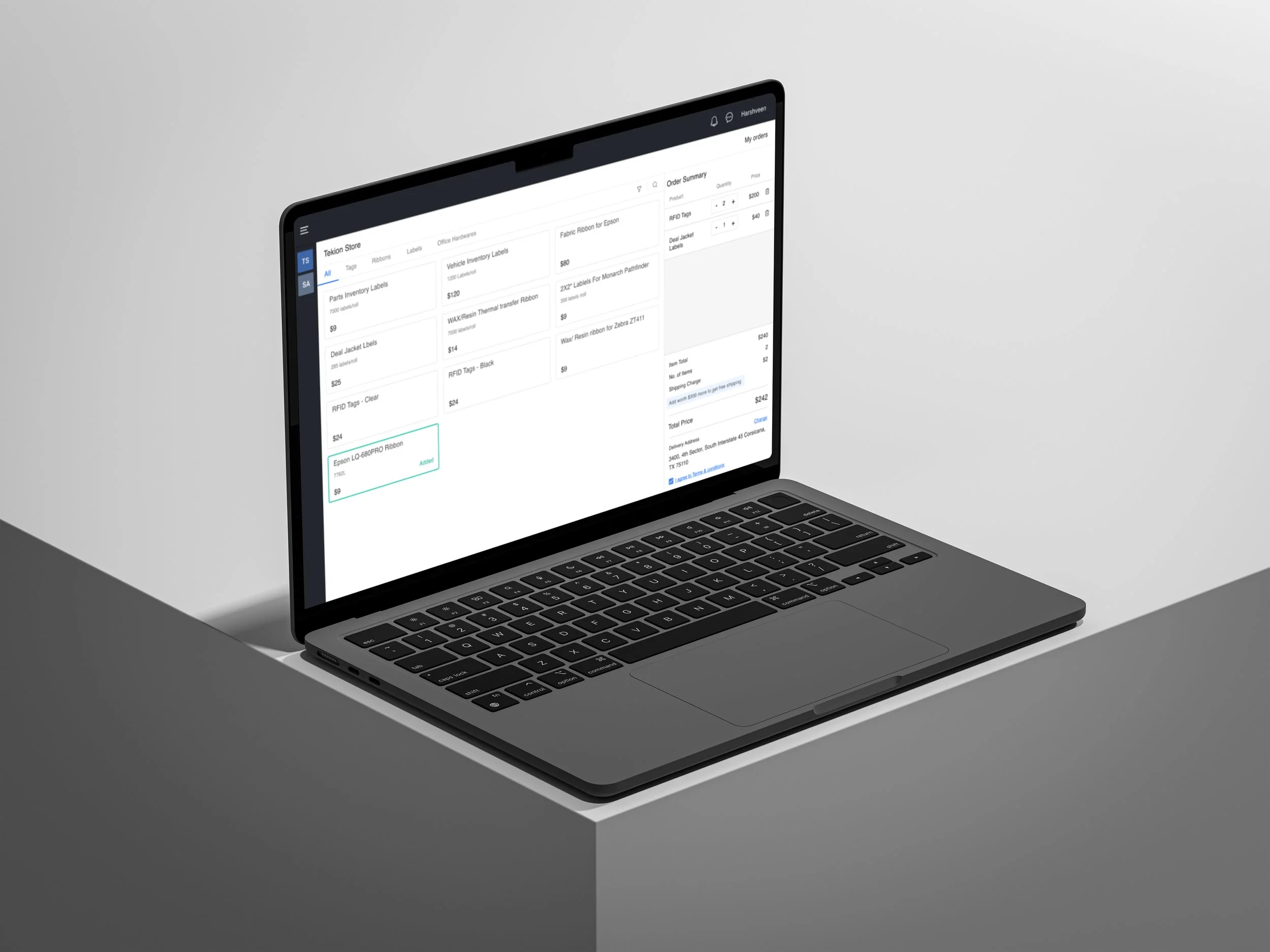
Tekion Store @ Tekion
Solving the automotive inventory management workflows, reducing manual effort, and improving setup completion time by 80%.

Rethinking Financial Advisory @ Fince
Building a product for the 68.7% who struggle with financial decisions.
Forms Creator Tool @ LeadSquared
Building a product for the 68.7% who struggle with financial decisions.